PICKING UP ON THE SMALL THINGS
A lot of good UX lies in the finer details - small but mighty cogs that hold up a giant, perfectly functioning system. These details have a tangible impact and often become the invisible edge that sets a product apart from its competitors. Identifying and refining these is where design makes the difference between a product that simply works and one that feels exceptional - and that’s where I come in.
Documented below are a few examples of those small but mighty design decisions - moments where subtle UX improvements led to outsized impact, turning everyday interactions into experiences that feel seamless, supportive, and memorable.
01
RESOURCE CENTER
Transforming a fragmented doc-org experience into a single, intuitive resource center for plan owners, advisors
02
FEATURE BANNER
Helping users discover and engage with new capabilities without interrupting their tasks.
THE CHALLENGE
BUILDING A SINGLE SOURCE OF TRUTH FOR ADVSORS TO RELY ON TO ACCESS THE LATEST VERSION OF IMPORTANT DOCUMENTS & RESOURCES
Users frequently visited the advisor dashboard seeking educational content and product guides but often got lost in a maze of disconnected links. Valuable resources existed—but poor hierarchy and unclear entry points meant they went unnoticed.
Advisors usually had to search multiple locations to source the right documrnt and often lost precious time making sure they had the most updated forms for important paperwork.
01
WHY THIS MATTERED
This project emerged while I was working on digitizing the advisor onboarding flow, which relied heavily on multiple forms and templates. Gathering all the relevant documents turned out to be the most time-consuming part of the process - there was simply no single place to find them.
This was an important step and could not be overlooked as a majority for financial documentation is heavily dependant on having the right paperwork.
This mattered because advisors often operate under time pressure, juggling multiple client needs. Searching through old emails or folders for the “right” document was a source of daily frustration.
Early Insights from User Research
Before this update, there was no dedicated space on the platform for frequently used documents. Advisors relied on an ad-hoc system—sharing plan templates, onboarding checklists, and investment guides through emails or personal folders.
-
Users relied on workarounds because documents were hard to find.
-
Naming inconsistencies caused confusion.
-
Users couldn’t tell which documents required action.
-
Role-based visibility was unpredictable.
-
Documents lived across multiple systems.
-
Search didn’t match how users looked for documents.
-
Compliance changes created version-control anxiety.
“I can never find what I need when I actually need it.”
“The search results are rarely what I’m looking for.”
“Sometimes I log in and documents are missing, but my admin sees them… it’s confusing.
“I don’t trust that what I’m seeing is up-to-date until I confirm with someone.”
“I’m always double-checking with our rep to confirm I’m looking at the latest version.
What we developed
Giving them one dependable place to find what they need removed friction from their workflow and freed them to focus on what truly matters—serving their clients.
-
Centralized, searchable Document Hub — unified storage with robust filters (type, date, plan, participant).
-
Clear document states & actions — downloaded, signed, pending, expired; with obvious next steps (download, e-sign, request help).
-
Metadata & taxonomy — consistent naming, tagging, and versioning to support compliance and audit trails.
-
Contextual access controls — role-based visibility so advisors, admins, and participants see appropriate documents.
-
Inline guidance & templates — short how-tos and pre-filled templates for common tasks (e.g., beneficiary change).
-
Integration touchpoints — surfaced relevant documents in the client dashboard and workflow screens to reduce context switching.
Intelligent Filtering
Intelligent Filtering
BASIC
DOCUMENT LIBRARY
INTELLIGENT FILTERING
& SORTING
WELL-ROUNDED
RESOURCE CENTER
IMPLEMENTING SCALING STARTEGIES
The first version was a simple, centralized page containing all relevant documents in one place. This eliminated the need for ad-hoc sharing and served as an initial “single source of truth.”
To improve usability, I introduced search and filtering options — enabling advisors to locate resources by type, category, or purpose quickly. This reduced browsing time and improved efficiency.
In addition to documents, it now included guides, best practices, FAQs, and links to related tools — creating a one-stop hub for both operational and educational needs.
Breaking down the path to the best version of the product into achievable and usable milestones.
MEASURABLE IMPACT
Cut search time
for important documents significantly through centralized access and smart filtering.
Improved accuracy and compliance by ensuring everyone used the latest version of each file thus eliminating holdbacks in processing.
Enhanced platform value
by expanding from a file library into a multifunctional advisor support hub and a reliable resource center.
This effort went beyond simply having documents in one place.
A dedicated Resource Center isn’t just a convenience — it’s a productivity multiplier. The shift from scattered, informal file sharing to a structured, evolving hub ensures advisors always have the most accurate information at hand, builds trust in the platform, and creates space for continued feature growth.
.
What started as a document library evolved into a well-equipped resource center for advisors

THE CHALLENGE
helping returning users adapt to a more complex interface to quickly regain confidence and orientation within the new design.
During the redesign of the advisor dashboard at PCS Retirement, several new features were introduced, including goal tracking, data visualizations, and priority alerts. While the interface was more robust, it risked overwhelming returning users who were unfamiliar with the changes.
While the new dashboard offered richer functionality, many returning users were hesitant or uncertain about interacting with the updated tools, making adoption and confidence a key challenge.
02
WHY THIS MATTERED
The redesign of the advisor dashboard introduced powerful tools for goal tracking, data visualizations, and priority alerts, moving the platform away from outdated workflows. While these features added significant value, returning users often felt nervous or unsure about using the new interface.
Addressing this was critical: if advisors struggled to adapt, they might underutilize the tools, reducing the effectiveness of the redesign and limiting their ability to serve clients efficiently.
Ensuring a smooth transition would also support long-term adoption, build user confidence, and reinforce trust in the platform. By making the experience approachable and intuitive, the redesign could empower advisors to quickly take full advantage of its modernized capabilities
INSIGHTS FROM EARLY RESEARCH
Early research highlighted a gap between the redesigned dashboard’s capabilities and user confidence in using them. Through advisor feedback sessions, customer service notes, and usability reviews, several key insights emerged:
-
Change anxiety was real. Returning advisors expressed hesitation when encountering the new interface. Many were concerned about “losing their way” or not knowing where familiar tools had moved.
-
Feature awareness was low. While the new dashboard introduced meaningful features, a lack of familiarity led to frustration and decreased trust in the interface.
-
Confidence impacted adoption. Without a clear introduction to new features or visual changes, many users resorted to trial and error, which led to frustration and decreased trust in the interface.
-
Guided onboarding for familiarity. Introduced a lightweight onboarding banner that highlighted what had changed and pointed users toward new features like goal tracking and visual analytics — helping them understand updates without interrupting workflow.
-
Contextual guidance in the interface. Added subtle prompts, microcopy, and tooltips at relevant points in the dashboard to guide users in real time and reduce uncertainty while exploring new elements.
-
Progressive discovery of features. Aim to evolve the experience in phases revealing new functionality gradually and nudging users to learn organically as they interacted with the system instead of overwhelming them all at once.
WHAT WE DEVELOPED
The redesign needed to feel familiar enough to rebuild trust, while clearly communicating what was new and why it mattered. The focus, therefore, shifted from purely visual or structural updates to creating an experience that guided, reassured, and reoriented advisors

35%
REDUCTION IN SUPPORT QUERIES
2x
BOOST IN TASK COMPLETION TIMES
85%
USERS FEEL MORE CONFIDENT USING THE LAB
measurable impact
What this helped achieve
This banner went beyond simply announcing “what’s new.”
It acted as a bridge between the old and the new, giving advisors a clear starting point in an unfamiliar layout.
THE CHALLENGE
SURFACING A LOW-EFFORT, HIGH-IMPACT TASK TO turn a buried, often-missed action into consistent
and on-time completion
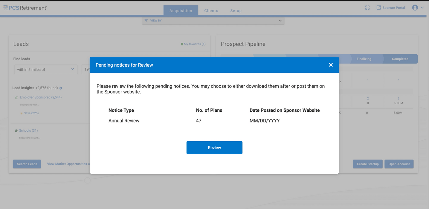
Advisors were responsible for posting annual plan reports - a quick but critical task that often slipped through the cracks. The action was buried deep within the plan detail page, hidden behind unrelated sections and multiple clicks.
With no clear visibility or reminder system, these reports were frequently delayed or missed altogether, leading to inconsistent reporting and potential client impact.
The challenge was to make this essential, low-effort task simple and prominent enough to be completed on time.
03
WHY THIS MATTERED
Report posting fell into the 80/20 category of advisor tasks — small, routine actions that required minimal effort but had an outsized impact on efficiency and compliance. Previously, it was buried deep within unrelated sections of the plan detail page, and advisors had to complete it independently for each plan.
When overlooked, these tasks created ripple effects: delayed plan updates, additional follow-ups, and diminished trust between advisors and clients.
Ensuring this task was easy and visible would not only improve efficiency but also strengthen confidence and accountability across the platform. By surfacing the task, simplifying the workflow, and providing clear feedback, advisors could complete it quickly and reliably, freeing up time for higher-value work and reducing friction in their daily routine.
INSIGHTS FROM EARLY RESEARCH
Early research through user interviews and workflow observations revealed several key patterns that were problematic and creating friction and inefficiency:
-
Buried action. The report posting feature was hidden within unrelated tabs on the plan detail page, making it difficult to locate — someone new to the system would likely never know where to find it.
-
Lack of task visibility. Advisors often didn’t know which reports were pending or overdue unless they specifically checked the section on the plan page, leading to missed deadlines.
-
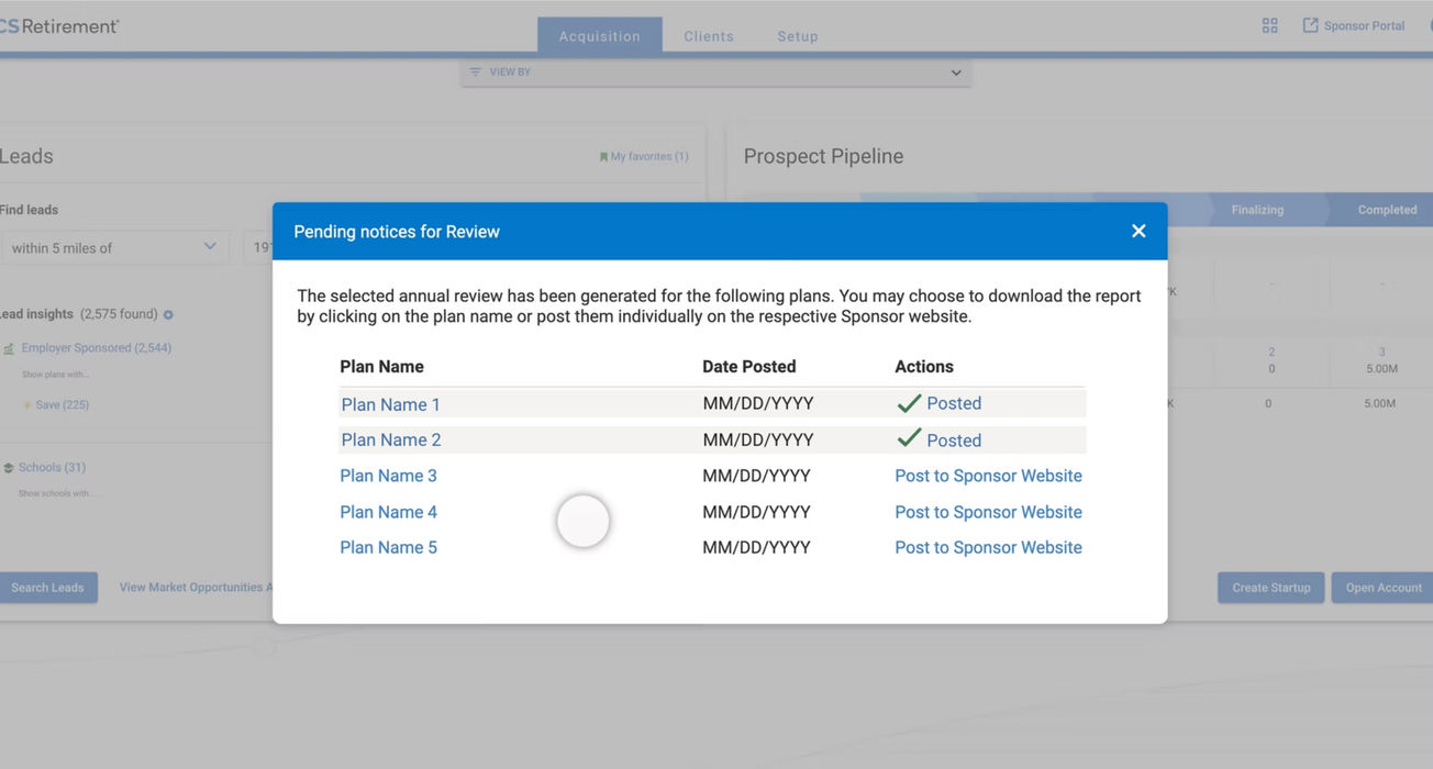
Redundant task repetition. Each report had to be posted separately for every plan, multiplying clicks and increasing the likelihood of errors or delays. This repetitive workflow consumed more time than necessary and contributed to frustration.
-
No reinforcement loop. Once a report was posted, there was no clear confirmation, leaving advisors uncertain if the task was successfully completed.
-
Single-click workflow. Elevated report posting to a primary action directly on the dashboard, reducing a multi-step, buried process to a single click. This minimized the cognitive load for users and allowed them to complete the task efficiently across multiple plans.
-
Priority cues. These overdue reports are displayed as soon as an advisor logs into their account. By surfacing these cues upfront, advisors can immediately identify what requires action without having to hunt through each plan page.
-
Task clarity. Added confirmation states and success feedback to reassure users that each report was posted correctly. Providing clear, immediate feedback reduced uncertainty and recorded date and time of posting.
WHAT WE DEVELOPED
The design focused on making this task effortless, visible, and repeatable, ensuring advisors could complete it quickly and consistently:
73%
INCREASE IN TIMELY POSTED REPORTS
4x
BOOST IN TASK COMPLETION TIMES
55%
USERS FEEL MORE IN CONTROL OF TASKS
measurable impact
What this helped achieve


